Showing posts with label text. Show all posts

Monday, 18 August 2014

Variations of new text + Tutor Feedback

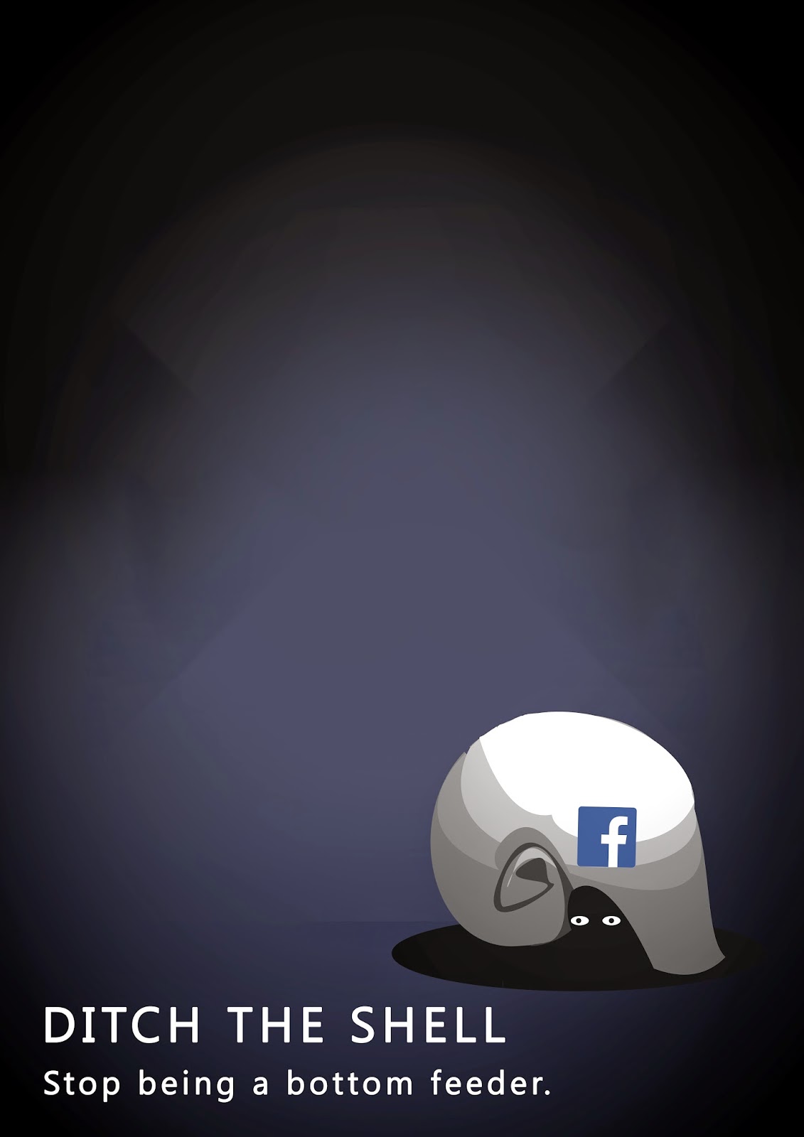
After a chat with the tutors today, they agreed with the new text direction that I was taking and to also continue working on the shell shape.

  • Refine the illustration of the shell and the 'shading' for 3-dimension effect
  • maybe try the new poster back with the Nautilus shell shape.
Here are some composition explorations with the new text (Please excuse the badly drawn bottom text)


New Text Type - Handdrawn

Ive decided to try incorporating hand drawn text instead of using clean - cut text typefaces. This will match my illustration style alot more directly, and hopefully give my poster a consistent style. At the moment I feel the poster has multiple styles going on and doesnt fit comfortably.

Heres some hand drawn text inspiration I took from to create this :


Thursday, 14 August 2014

Completely new composition

After playing around on photoshop with the new illustration, I tried putting the text in as a part of the background instead of floating around in space around the image. This is just a small test of new text experiments....


Monday, 11 August 2014

Text/Font Examples.

Here is a sheet compiled of different fonts that I could possibly use in my final poster. I need a clear, bold font that compliments the image and style of the illustration. At this point, I have no idea which one ill use.

In order, the fonts are

  • Garamond
  • Courier New
  • Impact
  • Orator Std
  • Trajan Pro
  • Fixedsys
  • Letter Gothic Std


Newly refined illustration

Here is my concept with a little more refinement in the illustration, set up to a composition that the tutor thought worked quite well.


Composition & Scale experiment

I have compiled some variations of text and image scale/placement using hierarchy, making the image overwhelming, making the image smaller and more insignificant etc. Hopefully this will give some good new options for my composition.


Text position variants

Here are a few examples of changing the text (head and tagline) position, I do still like the straight, upright triangle composition of text and image, but I think the lower left corner for text works quite nice as well...


Monday, 4 August 2014

Interim Finals + Feedback

These are the 4 finals that I produced for the interim presentation and critique...


Interim Feedback - Group Critique

"Unlock Your Life"
  • 'You are the key'
  • the lock needs to be locked, rather than unlocked- stronger message
"Feeling Trapped"
  • he becomes part of the computer
  • gets sucked in to the screen/computer
  • side view/face pressed against the screen
"Shell"
  • snail shell? - 'Catch up with your life' - new possible tagline
  • social media : is the crab grabbing the shell
  • something that grabs away the person, having a life...
"Sore Thumb"
  • Cross out 'sore thumb' - too obvious
  • address the heading without the tagline
  • specify the idea of 'online maintenance'
So overall, the group decided that the 'shell' image and 'lock' image were the two strongest ideas/concepts and that I should use those to develop further. 
At this point, I think I will choose the "shell" concept to develop as my final.


Sunday, 3 August 2014

VCD Poster/ Examples for Inspiration

Here are a few examples of posters that I enjoyed/responded to quite well. These designs are simple, minimal but very beautiful and effective. Some have messages a little more serious than others, but still, effective. Some don't have messages at all, just information.


Monday, 28 July 2014

Tutor Feedback Notes

Heres a list of notes jotted down from today's one-on-one session with Matt. 


  • Continue the 'Break The Bubble' idea > 'burst'
  • break the 'shell' idea could be continued and to generate more concepts
  • breaking out of something
  • cocoon > hatching
  • breaking free 
  • re-birth
  • trapped- idea of imprisonment
Imprisonment ideas/objects
  • chains
  • lock/ locked
  • ball and chain
  • hand cuffs
  • prison/cell
  • stocks
  • iron maiden
Ideas generated>
  • person sitting at a computer (back view) shows them sitting in the chair with a ball and chain around their ankle, glued to the computer screen.
  • Close up of eye/pupil with a lock/keyhole - caption "conversation is the key"
  • or close up idea of pupil with a 'like' logo in the eye.
  • image of an unlocked keypad
  • idea of using the 'shell' (generated from crab-random input exercise) as a protective, fragile casing of social media, that we need to break free from and to stop being dependant on.
  • using idea of 'bottom feeder' (generated from crab-random input exercise) to represent internet 'trolls' and cyber-bullying and scraping the barrel for people's personal information

4 A4 examples of Image + Text Trials


Continuing Thumbnail - Headline work

Here are a couple pages of thumbnails of concepts that I have decided to try with headlines + taglines.


Sunday, 27 July 2014

Word/Headline research.

I came across these clever advertising campaigns from HSBC Bank, showing that different words connected to the same image can give such different meanings and moods.


Applying text (Headline + Tagline)

Adding text to a concept


  • Say it in 3 words
  • Say it in one word
  • Say it in the voice of a child
  • Say it in the voice of someone who is 100 years old
  • Say it in a serious tone
  • Say it in a humorous tone
  • Try different voices from around your topic

Here are a few thumbnails from today's class session that I drew up and applied text to during studio session...

So far, my main angles that I'm taking on anti-social media are 
  • breaking the 'bubble', coming back to reality 
  • focusing on physical repercussions
  • incorporating body (physical) with virtual (social media)