Thursday, 14 August 2014

Refined Illustration style.

Instead of doing a clean 'vector' style, I still want to keep the layered (vector) illustration but with a 'chalky' rendered look. Here is an example of what i'm talking about....

Artist Annie Carbo:


I really like this illustration style. It is still clean cut, but with a softer and more hand-drawn look.
I think this will benefit my poster because I dont want my message to feel forceful, but more passive aggressive. This style will also add some subtle detail to my image, which can do so much more than just clean cut straight colours. 

Monday, 11 August 2014

Text/Font Examples.

Here is a sheet compiled of different fonts that I could possibly use in my final poster. I need a clear, bold font that compliments the image and style of the illustration. At this point, I have no idea which one ill use.

In order, the fonts are

  • Garamond
  • Courier New
  • Impact
  • Orator Std
  • Trajan Pro
  • Fixedsys
  • Letter Gothic Std


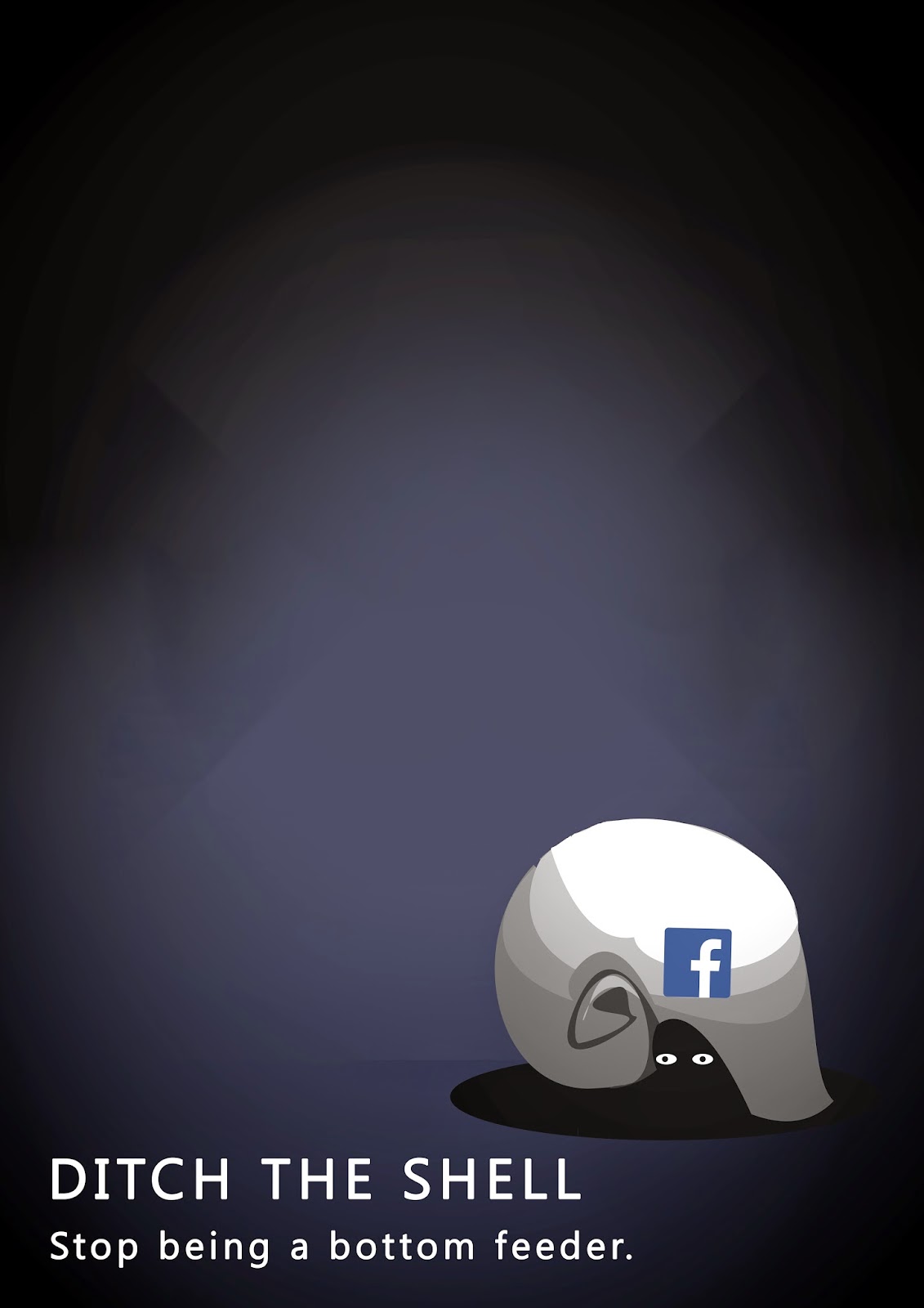
Newly refined illustration

Here is my concept with a little more refinement in the illustration, set up to a composition that the tutor thought worked quite well.


Nautilus Shell refinement

Here are some more 'nautilus' shell images to work from. After seeing one of the tutors today, she recommended I look at perfecting the image of the shell and to get the organic shape right. 


Composition & Scale experiment

I have compiled some variations of text and image scale/placement using hierarchy, making the image overwhelming, making the image smaller and more insignificant etc. Hopefully this will give some good new options for my composition.


Text position variants

Here are a few examples of changing the text (head and tagline) position, I do still like the straight, upright triangle composition of text and image, but I think the lower left corner for text works quite nice as well...


Sunday, 10 August 2014

Class cross-over feedback

Here is some feedback I received from the class cross-over today


  • overall good, strong message conveyed appropriately through nice simple imagery.
  • think about font styles and ways the text can improve the overall poster.
  • good composition, strong triangle shape. 
People seem to think that my idea/metaphor is quite clear and strong, which is good. I think that I can keep experimenting with different head/taglines and where the text would be positioned. By doing this I will be able to create completely different posters, using the same elements, but in different compositions. (Going against my original statement of keeping the composition for the final)