Jamie Bottomley
Wednesday, 20 August 2014
Rationale
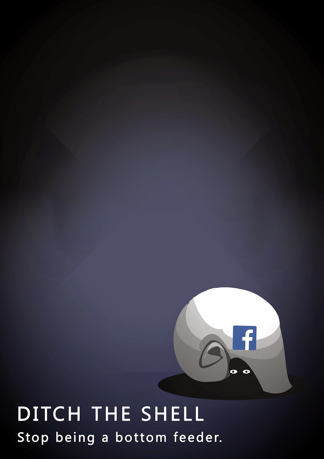
This poster is an anti-social media, propaganda-style parody of an old horror movie poster. It is a sharp and rough illustration style with a vectorised hand-drawn text. The pastiche rhetoric is very subtle, but recognisable, as well as the colour, which is a very moody palette. The poster has been designed to provoke a slight realisation in all of us and to persuade us to use social media less. After a good observation of the poster, the viewer will understand the visual metaphor and apply it upon themselves and their own personal relationships with social media. The strong visual movement drags the viewer down from left to right, diagonally, from headline to image to tagline. The desired reaction of Ihi and Wehi is for the viewer to take in the poster, admire the subtle horror parody and then take the messages upon themselves to stop and take a step back from their own lives. I hope the end result of this Wehi is for us to resist using social media and to encourage people to come back to reality.
Resolved Composition + Final
Here is the final composition I resolved and printed for final mounting.

Monday, 18 August 2014
Variations of new text + Tutor Feedback
After a chat with the tutors today, they agreed with the new text direction that I was taking and to also continue working on the shell shape.


- Refine the illustration of the shell and the 'shading' for 3-dimension effect
- maybe try the new poster back with the Nautilus shell shape.
Here are some composition explorations with the new text (Please excuse the badly drawn bottom text)
New Text Type - Handdrawn
Ive decided to try incorporating hand drawn text instead of using clean - cut text typefaces. This will match my illustration style alot more directly, and hopefully give my poster a consistent style. At the moment I feel the poster has multiple styles going on and doesnt fit comfortably.
Heres some hand drawn text inspiration I took from to create this :

Heres some hand drawn text inspiration I took from to create this :
New composition tests
Here are a few different composition experiments using my new poster elements (large text, different - hand drawn image etc)


Sunday, 17 August 2014
Poster Wall Test
Here's a quick test of putting the poster in context with the provided 'poster wall'
.jpg)
Trials of Tutor feedback...
After a quick session with hanging the posters up on the wall, the tutors recommended that I :

- try putting the word 'shell' in front of the image instead of behind it
- try shortening the shell (not so many layers to the shell shape)
- make the Facebook logo look stamped on to the shell instead of 'floating'
Here is a quick composition applying these changes:
Thursday, 14 August 2014
Completely new composition
After playing around on photoshop with the new illustration, I tried putting the text in as a part of the background instead of floating around in space around the image. This is just a small test of new text experiments....

'Chalk' Illustration Test
Here is my first attempt at capturing Annie Carbo's style. I used photoshop layers to keep the edges clean and downloaded photoshop chalk brushes for the painting. I really like this rough, digital painting look, its simple but effective, with little work.

I also changed the type of shell (still a hermit crab, but not the Nautilus style shell) because I had trouble rendering the more rounded shell to look familiar. I feel like this shell will be more recognised and associated with hermit crabs.
Refined Illustration style.
Instead of doing a clean 'vector' style, I still want to keep the layered (vector) illustration but with a 'chalky' rendered look. Here is an example of what i'm talking about....
Artist Annie Carbo:


Artist Annie Carbo:
I really like this illustration style. It is still clean cut, but with a softer and more hand-drawn look.
I think this will benefit my poster because I dont want my message to feel forceful, but more passive aggressive. This style will also add some subtle detail to my image, which can do so much more than just clean cut straight colours.
Monday, 11 August 2014
Text/Font Examples.
Here is a sheet compiled of different fonts that I could possibly use in my final poster. I need a clear, bold font that compliments the image and style of the illustration. At this point, I have no idea which one ill use.
In order, the fonts are

In order, the fonts are
- Garamond
- Courier New
- Impact
- Orator Std
- Trajan Pro
- Fixedsys
- Letter Gothic Std
Newly refined illustration
Here is my concept with a little more refinement in the illustration, set up to a composition that the tutor thought worked quite well.

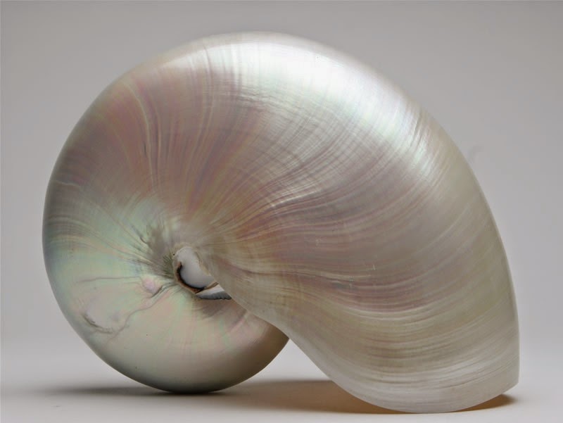
Nautilus Shell refinement
Here are some more 'nautilus' shell images to work from. After seeing one of the tutors today, she recommended I look at perfecting the image of the shell and to get the organic shape right.


Composition & Scale experiment
I have compiled some variations of text and image scale/placement using hierarchy, making the image overwhelming, making the image smaller and more insignificant etc. Hopefully this will give some good new options for my composition.


Text position variants
Here are a few examples of changing the text (head and tagline) position, I do still like the straight, upright triangle composition of text and image, but I think the lower left corner for text works quite nice as well...


Sunday, 10 August 2014
Class cross-over feedback
Here is some feedback I received from the class cross-over today
- overall good, strong message conveyed appropriately through nice simple imagery.
- think about font styles and ways the text can improve the overall poster.
- good composition, strong triangle shape.
People seem to think that my idea/metaphor is quite clear and strong, which is good. I think that I can keep experimenting with different head/taglines and where the text would be positioned. By doing this I will be able to create completely different posters, using the same elements, but in different compositions. (Going against my original statement of keeping the composition for the final)
A2 Printout for Week 5
Here is a quick rendition of my visual style and 'shell' poster concept for class tomorrow. I have printed this out in A2 size. The font, text, colour, shell style and illustration aren't final, but the composition layout will be the final template.

Saturday, 9 August 2014
Image research of Hermit crabs/shells
Here are a few images inspiring the design of the shell that will be the main image for my poster. I think that getting the shell correct will help the design to have an authentic feel.


Subscribe to:
Comments (Atom)